
EVERY SPACE HAS A STORY
Think about a space, any space. It could be in your own home or a space you remember from your travels. Picture the space in your mind. How did the energy feel in that space? What stood out to you visually? In fact, maybe you're sitting in that space right now. THAT space has a story.
When we design a space, we think about all of the pieces in that space as a whole and how the entire space has a dialogue. Each item and finish has a purpose and one of the most important finishes in any room is paint. Whether it’s on the walls or cabinet doors, paint color is critical to any design. So many people are intimidated by paint colors mainly because there’s so many to choose from. To us that’s the beauty of paint. The more colors the better! When we choose a paint color for a space, the process is the same as choosing any other item. And not only does the color of the paint matter, but the finish of the paint matters as well. The paint color and finish in a room helps tell the story of the space.
Portola Paints, the masters of paint and some of our favorite to work with! They have designed a full spectrum of paint colors and created unique finishes that completely transform any space. We’re drawn to their Lime Wash and Roman Clay finishes as they provide an antiqued natural texture that constantly reminds us of our travels. We’ve used them in several projects and most recently our project Van De Vort and Kaito Sushi. In each project we used different colors for different reasons.
VAN DE VORT

When we first conceptualized this project, we knew we wanted to create a space with old world vibes, antique accents and finishes that looked as though they had been there for years. Portola Paints, Lime Wash finish was the perfect touch. We covered the dressing rooms in Mare Island to compliment the wallpaper that lived inside. As you enter the space you’re immediately drawn to it’s richness. To us, this color and finish represents regality and wealth, perfect for a retail space, wouldn't you say?

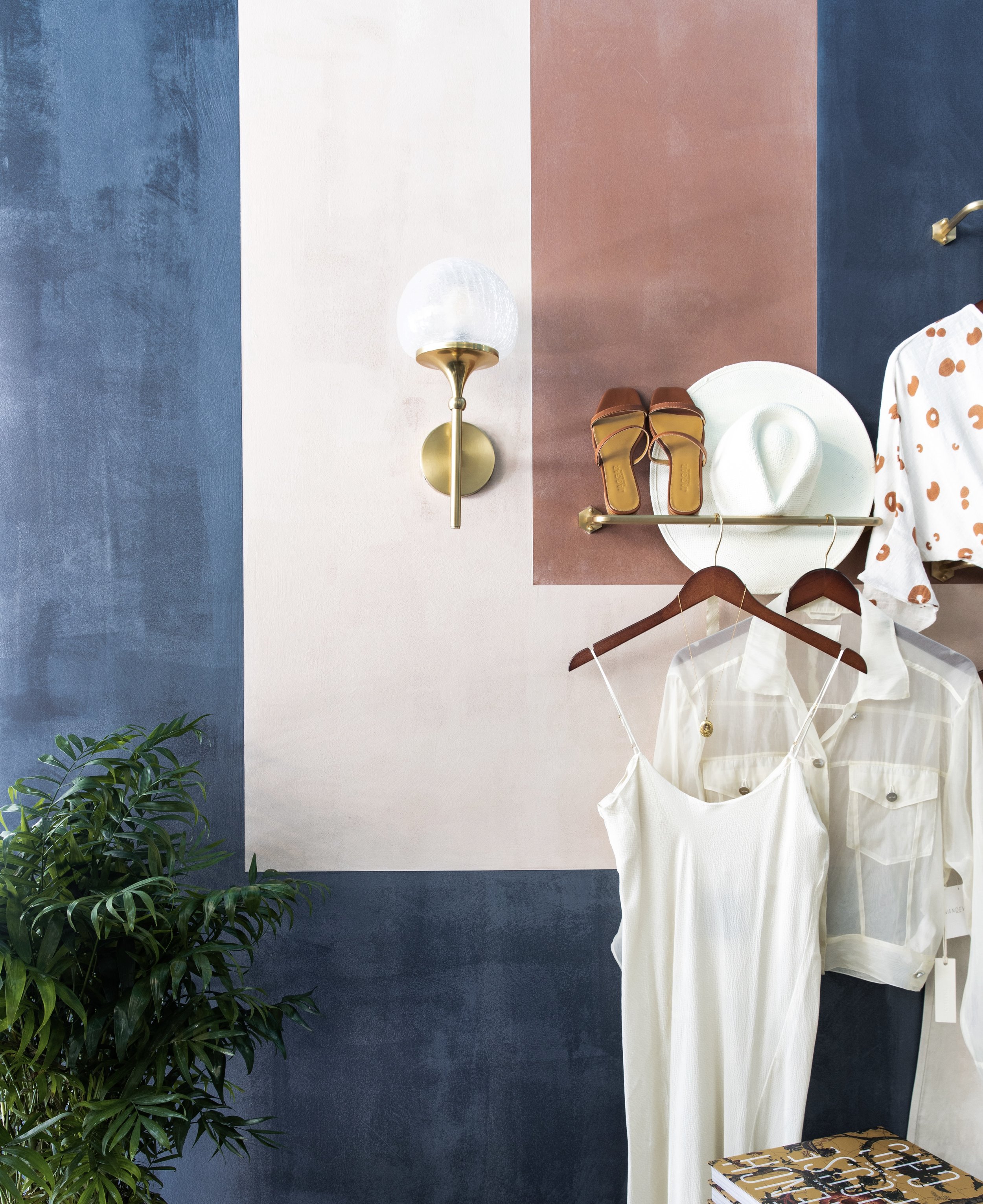
To modernize the space we color blocked a feature wall with Portola Paints - Lime Wash finish in some of their Roman Clay colors (finish colors can be translated to the various finishes, just talk to the friendly staff at Portola Paints) Society, Costes and Mare Island. The pink tones help soften the space, creating an inviting and comfortable atmosphere for the customer!

KAITO SUSHI

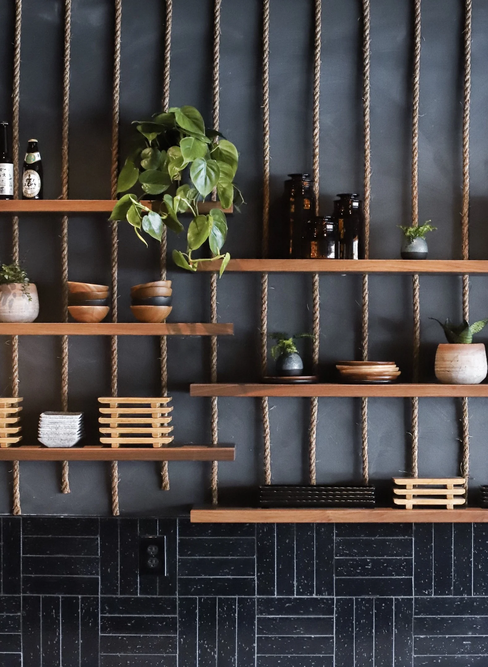
Our project Kaito Sushi was a completely different space than Van De Vort yet Portola Paints was a perfect application in this space as well. We used Portola Paints - Lime Wash finish in Roman Clay colors Fade to Black and Nitty Gritty. We wanted the space to feel moody and masculine. In addition, we wanted the walls to look leathered and worn, as if you were stepping into a fisherman’s cave.


EVERY space has a story. These are two very different stories yet the application was the same! Portola Paints helped achieve our vision for each space and tell their story. What story is your space trying to tell you?
Love, The Sisters